
7 in 7 Data Visualization - Major Studio 2
SOFT SCIENCE - A DATA VISUALIZATION

7IN7 1 - book scans that included images

7IN7 2 - books by relative size
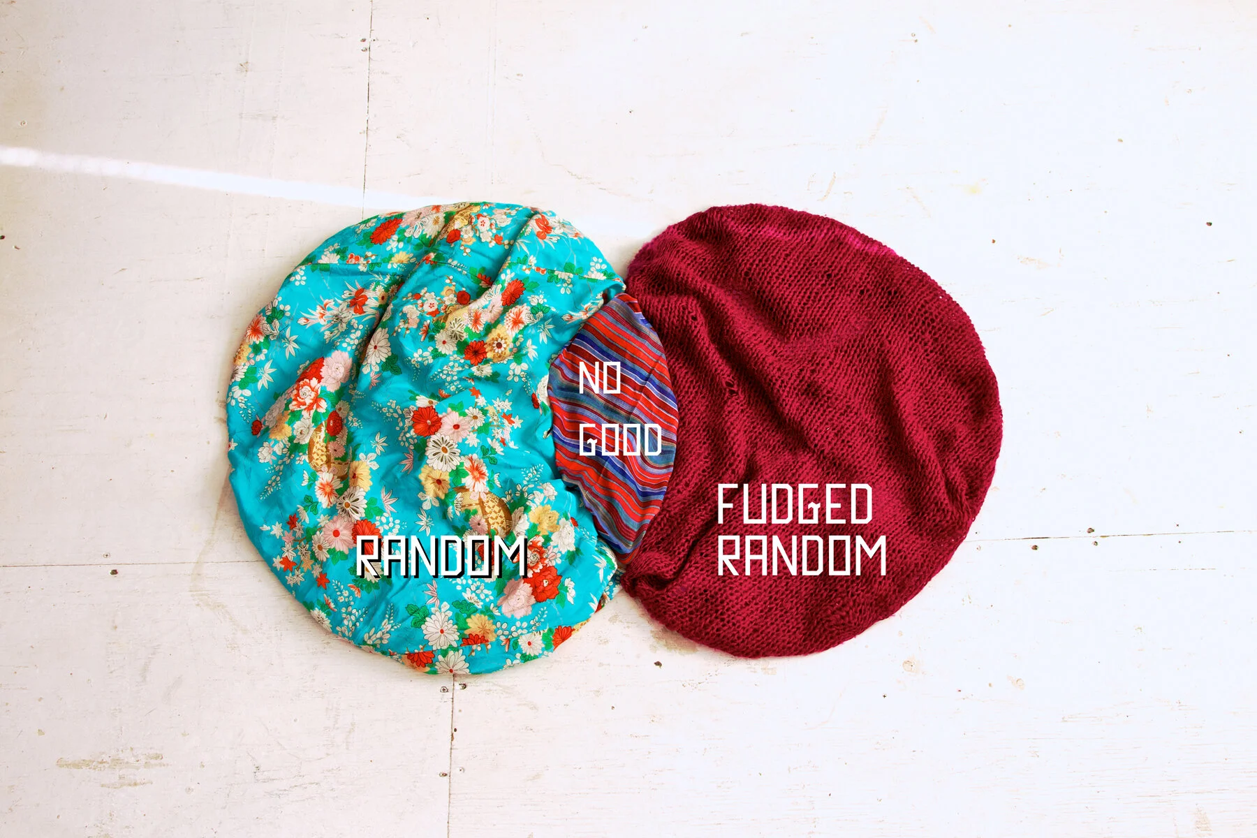
7IN7 3 - how often I stuck with my algorithm

7IN7 4 - number salad

7IN7 5 - book topics, outliers excluded

7IN7 6 - relative amounts gained, as perceived by me

7IN7 7 - Numbers tell a story
For more information on the process and the inspiration see the previous post.

5 in 5 Day 1 - Major Studio 1
Personal Food Guide Pyramid

I've decided to use this time to focus on food. Specifically on feeding myself. The act of consuming food has much cultural significance and yet in the last 100 years we've lost our natural priority to commune and sup together. Local bounty, seasonal specialties and annual feasts have lost their connection and meaning. Yet we are inundated with choice.So I've made my own food guide based on my own observations and preferences. Damn the man and his pyramid.

USDA Food Pyramid - 1996
In order to deal with this assault of choice we invented the Four Food Groups. Then the Food Guide Pyramid. Now there's Choose My Plate. All of them a weird visualization of a probable compromise between the USDA and the dairy, beef, corn, and soybean lobbies. But it's hard toss out, even with the knowledge of it's, um, less than nutritional inception. The food guide pyramid was the first data visualization to impact my life. But how did we get to this point? Do we need something like this to remind us of what it means to eat a good meal? And if one were to follow the classic food guide pyramid would you really be eating all that well?

US Food Administration - 1883

US food guide -1916

choosemyplate.gov - 2007